How to make a successful poster
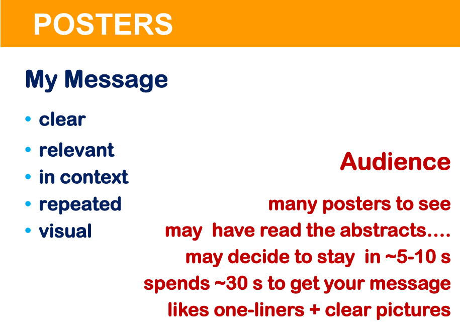
Effective posters convey a clear message by using high impact visual information and a minimum of text.
WHAT IS A SUCCESSFUL POSTER?
A poster can be considered successful if it conveys a clear message to the visitor, and generates valuable feedback to the presenter.
In order to achieve this, the poster needs to be crystal clear about the objectives, the approach, the main results and the major conclusions of the work, and all this preferably within the proper perspective of existing knowledge on the particular subject.
FREQUENT MISTAKES
Too many posters do not succeed in getting their message across. Here are some of the main errors that designers of posters make:
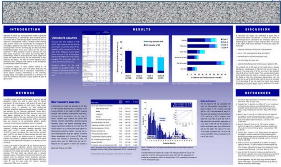
- Too much text. Probably more than half of all scientific posters contain too much text. Some posters look like a blown-up version of a short article. Who will have the time or the patience to read all this?
- Unclear layout and context. If key elements such as objectives, approach, conclusions, or perspective are missing, it will be hard for anyone who is not an insider to understand why your poster is relevant (and why he/she should spend time on it).
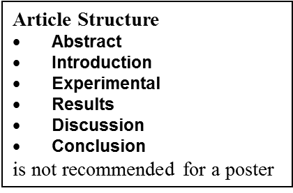
- Inappropriate structure. Many people blindly apply the standard structure of a written report (see text box below), thereby using their poster as a sort of miniature article, which almost automatically leads to a lot of text. There is no need at all to apply any standardized structure for a poster, feel free to use any format you feel is appropriate. Nevertheless, it is good to start with a brief introduction stating the aims and relevance of the work, and to end with a concise conclusion.
- Poor figures. Some figures may be real puzzles, with incomprehensible legends, secret codes, small lettering, and cryptical captions, etc. Note that many spreadsheet and data programs do not produce “reader friendly” graphics.
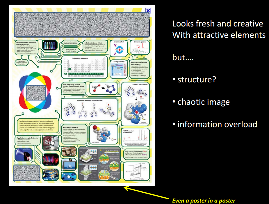
- Too much information. Many presenters overload their posters with too many data, and greatly overestimate the time that the average visitor is willing to spend on the poster.
- No presenter present. This is obviously a missed chance for valuable discussions. Ideally a presenter should be able to make a short highlight presentation to summarize the content, and point the visitor to the most salient features of the work, after which usually some question and answer interaction arises.
- Passive presenter. Another frequent mistake is that presenters take a passive attitude and make no effort to establish contact or initiate discussions.
It’s all about interaction.
Posters offer great opportunities to meet people, to discuss work, to obtain feedback, to test out ideas for interpretation of results, or to get new ideas for research. You need to get into discussion with the visitors, however, and a too passive attitude may mean that you hardly speak with the visitors.
Maybe you are shy, or you think it is not appropriate to address people who you regard as experts? Don’t worry, everybody will appreciate it if you for example say: “Welcome to my poster, my name is John Presenter from Whizzkid University. Can I give you a short tour of the poster, or would you prefer to read it by yourself?” Or anything else to let the visitor know that you are eager to talk about your work. Don’t be shy, most people will like your attempt to make contact this way.
Of course, take care that the interaction will be in two directions, and do not overwhelm your audience with all sorts of details if he/she are only interested in getting a quick impression.
IN EIGHT STEPS TO AN EFFICIENT POSTER
Step 1: The message of your poster.
Try to formulate the essence of what you want to present in a single sentence.
Examples of such sentences are:
“I want to convince the audience that my new catalyst is the best one for converting methane into ethylene.”
“Analyzing kinetic data on reaction x with our microkinetic model enables one to define better processing conditions.”
“The new ABC technique yields reliable surface areas of oxide powders.”
Use this sentence as a guide for selecting the data you need to include. You probably won’t actually print this sentence in the poster but it helps you to make up your mind what your poster is about.
Step 2: Introduction.
Write a few sentences of introduction to identify the problem you address, what is known about it, the objectives of your work and what your approach is to investigate the problem. Use short sentences and keep this section as concise as possible. Consider if complete sentences might be replaced by a bulleted list or by a graphic.
Step 3: Results.
Select the most pertinent results that support your message. Remove everything that is not absolutely necessary. Think about attractive ways to present the data in figures. Try to avoid tables as much as possible. Figures and captions should be easy to read (see also textbox x). Think about adding a conclusion to every figure.
Step 4: Conclusion.
Write the conclusions in short, clear statements, preferably as a list. Finish with an assessment of what you have achieved in relation to your objectives, and, perhaps, what your future plans are.
Step 5: Attention getters.
What are you going to use to draw people’s attention? An attractive title serves as such to some extent, but is not enough. Select one of your most important results, a photo, a clear scheme explaining the scientific background, a model or the main conclusion, or whatever you consider as highlight of your presentation and give it a prominent place on your poster. This is what the audience will see first. It should raise their interest and stimulate them to read your poster.
WHY >> WHAT
Many presenters focus on WHAT they have done and HOW, but the audience is usually more interested in WHY you did the research and what the ANSWER is, and what the possible implications are of your findings.
Hence try to emphasize why you have done the work, and what the answer is, rather than stressing too much what exactly you did.
Step 6: Layout.
Arrange all the parts of the poster around your attention getter. Add headers if necessary to clarify the structure of your poster, and add everything else that is needed, such as literature, acknowledgements. Ensure that author name(s) and affiliation are on the poster.
Step 7: Review, revise, optimize.
Ask your coauthors and/or colleagues to comment on a draft version of your poster. Assess very critically if the poster indeed conveys the message you want.
Step 8: Prepare.
Ensure that you can present the key message of your poster in a short time, e.g. 1 -2 minutes. This is the story that you can give to visitors who are browsing the poster before they decide if they actually want to read it.
Also, do some research on the attendants of the conference. Perhaps there are famous scientists in your area whom you would like to show your work. Don’t be too shy, people usually will appreciate your eagerness to share your work and many established professors will be happy to give their opinion on your work.
FINALLY
A good poster enables the reader to grasp the message in a short time, e.g. less than a minute. If he finds the subject of interest he will stay to learn about the details, and discuss the work with the presenter. If you fail to get the reader’s attention in a short time, he is likely to go on to the next poster, unless he really wants to know about your work.
Success with your poster!
We hope it will stimulate fruitful interactions with other scientists which will help you in your further work.

